The 10 Best Charity Websites 2026
26.08.2025
Non-profit websites thrive on compelling brand narratives. A strong story isn’t just a nice-to-have; it’s essential for connecting with audiences, cutting through the noise, and standing out in a crowded digital space. When it’s done right, the story resonates deeply; it can drive awareness, inspire action, and even lead to increased donations and engagement.
We’ve highlighted a few standout examples from charities and non-profits that get it right. Each one tells a powerful story with clarity and emotional impact, whether through bold typography, striking colour palettes, or photography and film that connects emotionally. Their websites are clean, easy to navigate, and focus on getting people involved and spreading their message. Every element works in harmony to support their mission and inspire their audiences.
💡Don't miss our guide to website accessibility for charities
Terner Labs
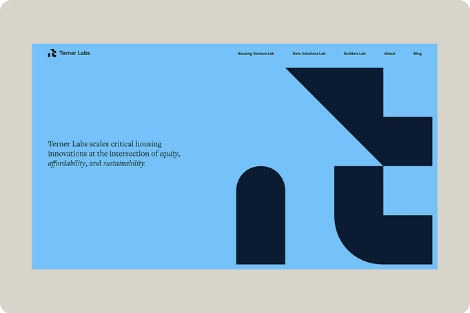
Terner Labs is a nonprofit organization focused on scaling innovative housing solutions that promote equity, affordability, and sustainability.
What we liked
The design features generous, well-defined shapes that echo the geometry and spirit of the brand logo, creating a cohesive visual identity throughout the interface. Bold, saturated colours are used confidently to establish a vibrant and energetic tone, while maintaining clarity and accessibility.
The overall layout is clean and uncluttered, allowing content to breathe and guiding the user’s attention with ease. There's a thoughtful balance between simplicity and visual impact, making the interface feel both modern and intuitive.
One of the standout elements is the inventive approach to content presentation, whether through dynamic grids, layered visuals, or playful transitions. The design invites exploration and keeps users engaged.
The use of oversized typography and distinctive icons adds personality and memorability to each page. These elements not only reinforce the brand’s voice but also serve a functional role in wayfinding, helping users quickly orient themselves and navigate with confidence.
The Best Place in the World to Have Herpes
thebestplaceintheworldtohaveherpes.com
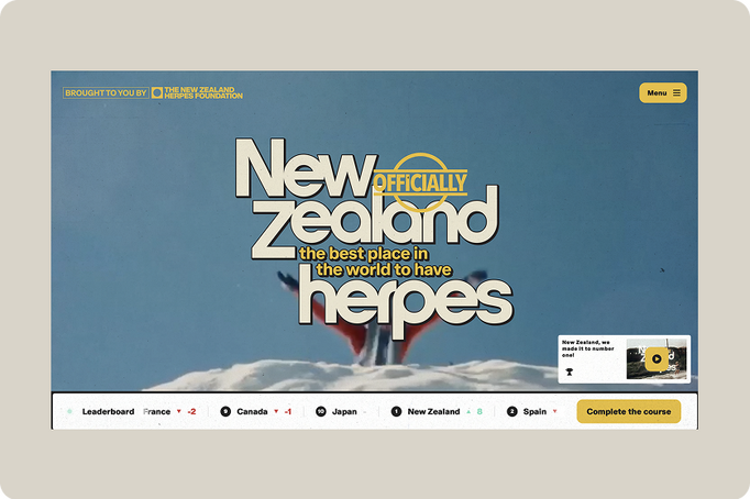
This bold and humorous public health initiative, led by the New Zealand Herpes Foundation and creative agency Motion Sickness, aims to destigmatise herpes through education, engagement, and national pride.
What we liked
It’s a refreshingly unconventional way to raise awareness. They use well-known personalities to amplify the message and employ gamification techniques effectively. The site’s retro aesthetic, styled like an ’80s video player, is bold, distinctive, and surprisingly effective, creating an instantly memorable experience.
Open Society Foundations
www.opensocietyfoundations.org
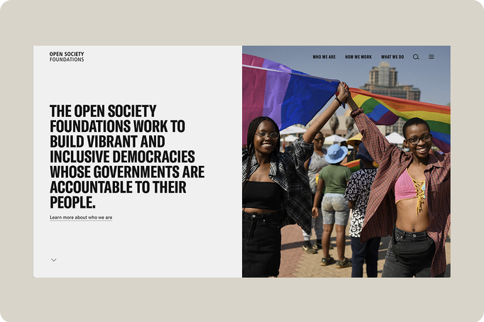
The Open Society Foundations is one of the world’s largest philanthropic organizations, founded by George Soros. Its mission is to build vibrant and inclusive democracies where governments are accountable to their people.
What we liked
Strong typography paired with a well-structured grid creates a clean and impactful layout. The site’s predominantly black-and-white palette, aside from the colour photography, feels stark and uncompromising. Against this backdrop, the green accent cuts through with striking clarity, adding a vivid focal point that energizes the overall design.
We love the story behind this not-for-profit. George Soros established OSF to promote democracy, human rights, and open societies. Over the years, he has donated more than $32 billion of his personal fortune to support the foundation’s work globally.
Axis
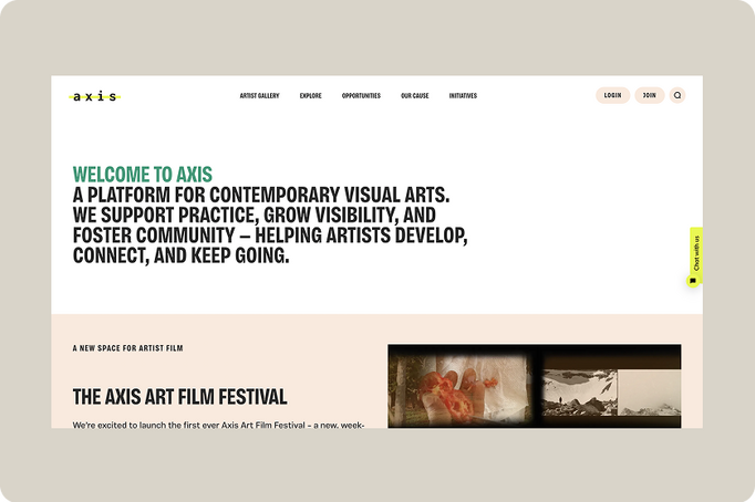
Axis is a UK-based independent charity and digital platform dedicated to supporting contemporary visual artists. It fosters artistic growth, visibility, and community through a range of initiatives, events, and resources.
What we liked
We love how the content is placed throughout the site; it feels artistic and visually engaging. The search function works seamlessly, giving the impression there's a rich depth of useful material to explore. The typography and colour palette strike the right tone, reinforcing the creative, arts-focused feel. And there are clear benefits for becoming a member, helping to grow their already well-established community.
Surfers Against Sewage
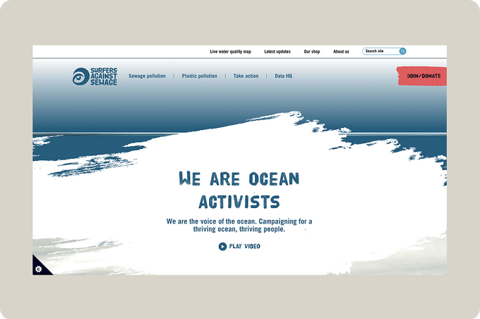
Surfers Against Sewage (SAS) is a UK-based grassroots environmental charity dedicated to protecting the ocean and promoting clean water for both wildlife and people.
What we liked
We love the brand and how it's applied to the site. Reasons for taking action are clear, and there are numerous ways you can lend your support, each clearly signposted with excellent supporting content.
Critical Danger
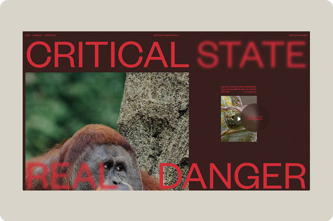
Critical Danger is a purpose-driven initiative that raises awareness and funds for endangered animals through art and apparel.
What we liked
The way typography interacts with the visuals, overlapping and weaving through, creates a dynamic, layered experience. Full-screen photography captures nature in its most breathtaking form, reminding us of its fragility and the urgent need to protect it. While the typography adds aesthetic appeal, the site’s colour palette grounds the experience, reinforcing the gravity of the messages conveyed through its content.
Charity: water
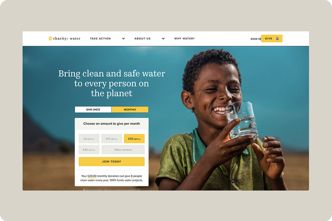
Charity: water is a global nonprofit dedicated to ending the water crisis by providing clean and safe drinking water to people in need.
What we liked
A clean, visually striking site with excellent photography. While rich in detailed content, it stays focused on its core purpose: inspiring donations. The user experience around giving is thoughtfully designed, guiding visitors to reflect on the impact of their contribution. Every donation counts.
Vincent Wildlife Trust
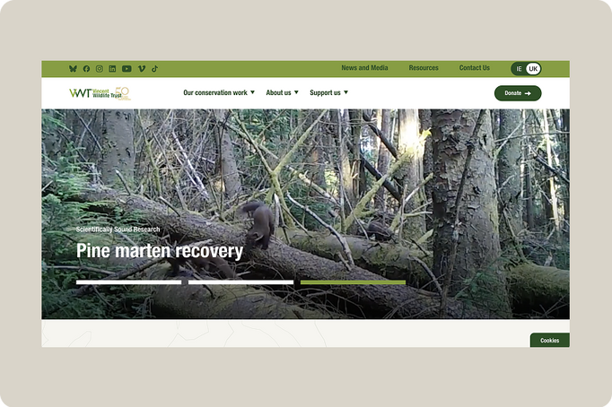
The Vincent Wildlife Trust is a UK-based conservation charity dedicated to protecting threatened mammal species across Britain, Ireland, and mainland Europe.
What we liked
The imagery and video content are superbly presented with a quiet confidence that lets the visuals speak for themselves. The overall aesthetic is compelling: at times raw and earthy, at others clean and scientific. That contrast adds depth. The leaf textures, in particular, are a standout, beautifully tactile and evocative. And who doesn’t love a pine marten?
The Obama Foundation
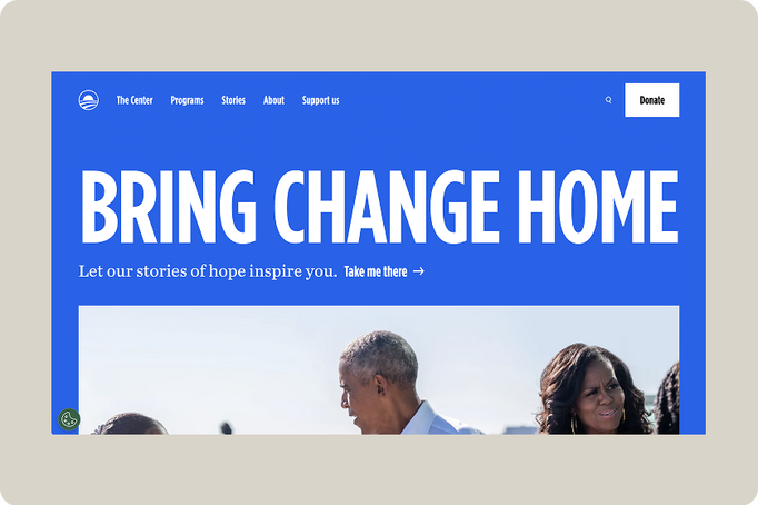
The Obama Foundation is a nonprofit organization dedicated to inspiring, empowering, and connecting people to create positive change in their communities and around the world.
What we liked
This site is impressively built – the bold Obama blue, the subtle motion, and the clever scroll hijacking that brings key sections into focus. The layout is clean, and the navigation is intuitive. Altogether, a thoughtfully crafted experience.
ALNF
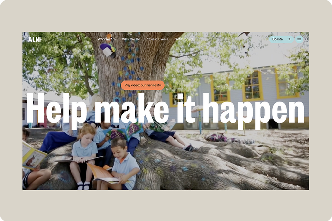
The ALNF is a registered Australian charity dedicated to improving literacy and educational equity across diverse communities. Their mission is to unlock potential and create brighter futures through the power of literacy and learning.
What we liked
This site is packed with great features, but from a design perspective, our standout favourites were the vibrant full-page navigation menu and the bold call to action in the footer. The thoughtful use of colour, typography, and motion is beautifully done and helps create an engaging experience throughout. The donation journey is smooth and intuitive, too.
Interested in working together?
As you can see, there are some great examples of charity websites out there. At Mud, we've got a lot of experience working with charities of all kinds. We pride ourselves on our creative approach, our transparent pricing, our honest communications, and our expertise in crafting impactful websites. So if there’s a project you want to discuss, drop us a line.