Site Design Group
Site Design Group
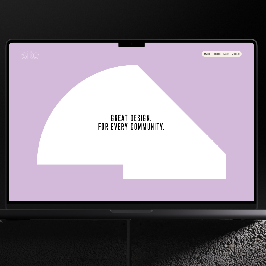
A brand and website with vibrancy and warmth, designed to place people at the heart of an American Midwest landscape architecture practice.
A landscape architecture practice with strong links to the architectural history of the city, the Chicago-based Site Design Group is trusted to transform outdoor spaces around some of the most significant historical landmarks and new inner city developments; not just in the state of Illinois, but across the globe.
Their existing website fell far short of mirroring the scale and impact of their award-winning work. The practice needed a fresh platform that could showcase their architectural rigour and the transformative results it was producing; 99% of their design work is realised — a ground-breaking success rate is the field. The brand needed to step up to better communicate their core belief that beautiful outdoor spaces benefit everyone.
Services provided
- Research and strategy
- UX design
- Prototyping
- Responsive website design
- Animation
- Content strategy
- Content design
- Front end development
- Craft CMS development
- Website hosting
The Challenge
With the current site underselling the practice on every level, the disparity called for a new brand strategy to guide the design and development of the new website. We brought in the strategic expertise of the brand folks at Thisaway, who established the foundation of a resolved brand platform to pave the way for a new digital experience capable of delivering on Site Design’s brand promise — ‘let’s cultivate community.’
A proudly Midwest practice with relational ties to the renowned architect Ludwig Mies van der Rohe, the new visual identity needed to nod to this modernist legacy and inspiration, and sense of locality, while promoting their practice on a global scale to support their new office in Tokyo, Japan.


The idea
While their interdisciplinary collaboration and track record wins client briefs, for Site Design, “It’s not the structures that are important - it’s who uses the spaces.” The satisfaction of local communities? That’s their marker of a project’s success.
The inclusive brand idea ‘because everyone deserves great design’ led us to explore design routes which felt relatable, to anchor the new visual identity in Site Design’s community-focused outcomes, and differentiate them among the stark, sterile feel of their competitors. This inspired a vibrant, optimistic visual language that was representative of their imaginative and collaborative approach, balanced with clean interfaces to lean into their innovation in design.
Visual identity
The visual identity is defined by colourful, graphic shapes distilled from the basic site outline of each project. No site footprint is identical, and the library of simplified shapes tell the story of the projects that have made the practice what it is today; like a digital record of their impact on the cityscape. In addition, the individual shapes support the branding of each project across digital and print formats. New siteplan symbols will be integrated in the visual system as the project archive grows, creating a fluid identity which evolves with the practice over time — just like their landscapes.
The colour palette needed to feel diverse, welcoming and inclusive to reflect the community cultivation at the heart of Site Design’s work. We set a range of warm, energetic tones on an off-white canvas to capture the sense of imagination and inclusivity that define the way the designs evolve in practice. A mix of black bold condensed display type with a humanist font used for longer form copy blocks up the contrast for a clean, contemporary feel and accessible reading.


Content design and architecture
Given that each project demands a completely unique, original design response, we developed the case study pages to be flexible to support the individual stories of each place. A series of content modules that could be ‘stitched’ together to build the narrative of each one. These included standard components like images and copy blocks, but also more interactive storytelling elements, such as project masterplans and animated images to reveal transformations; before and after, day to night. An audio module offers a more sensory dimension to allow users to hear what a place sounds like at different times of day.
From parks and waterfronts to city education campuses, we introduced a number of mechanisms to allow users to filter and explore the wide range of projects studies; by highlights, feature projects (either in plan or list view), or by category view, to promote discovery of the wide range of disciplines, outcomes and design rigour on show. The result is not only a conclusive showcase of their excellence in design, but a reflection of the transformative impact their inclusive and resilient landscapes have on their communities.


